‘WHAT THE PITTA’ RESTAURANT MURAL
Brighton
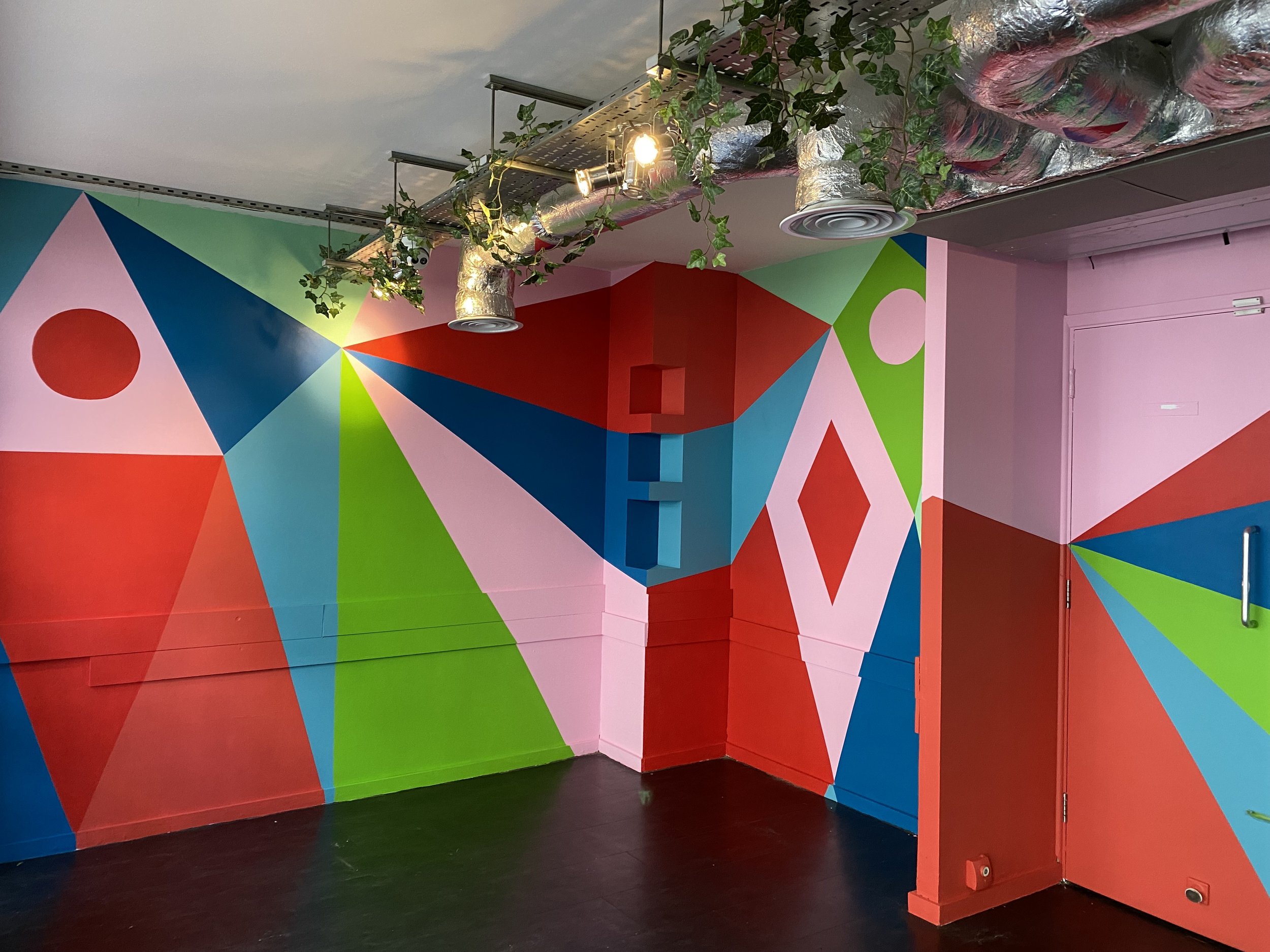
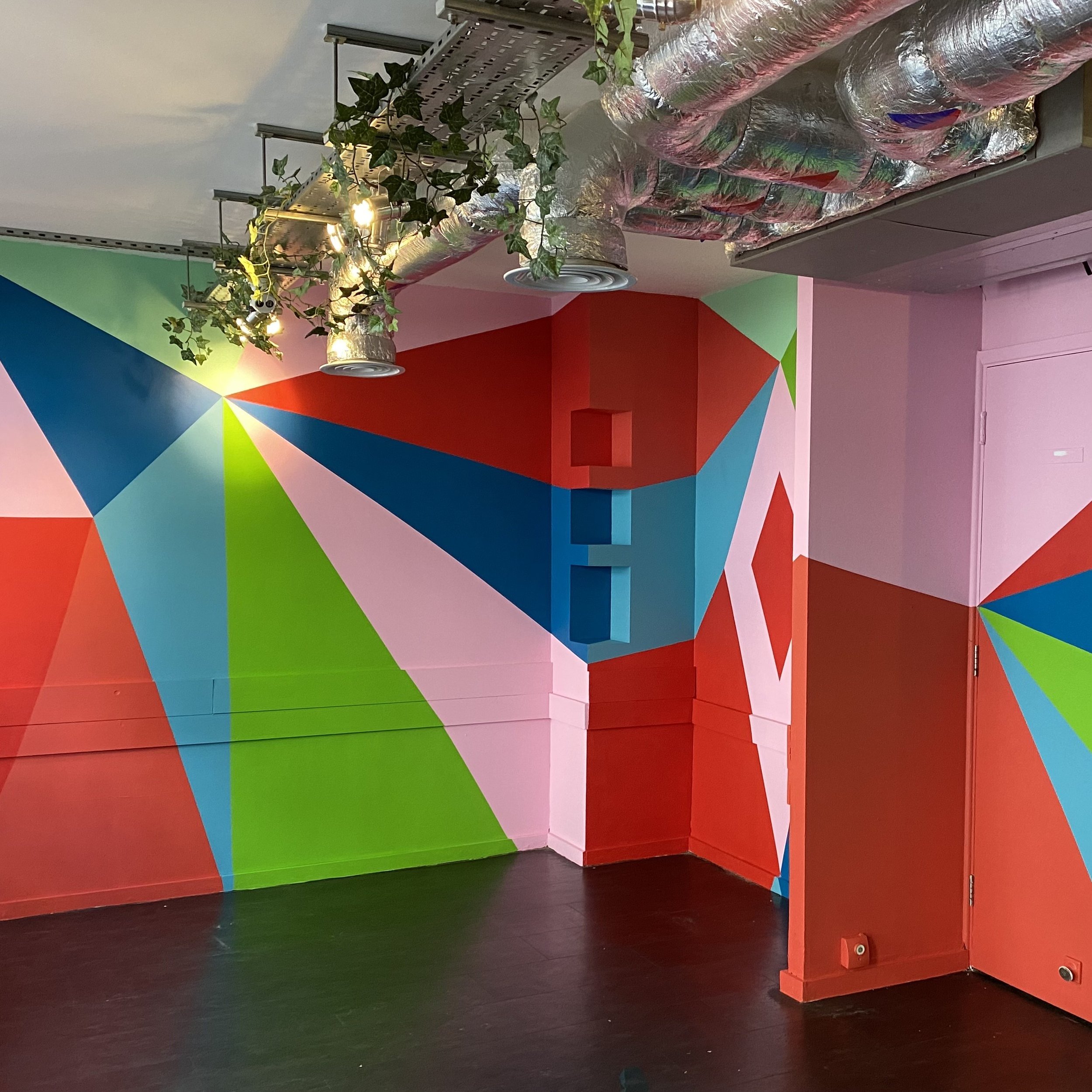
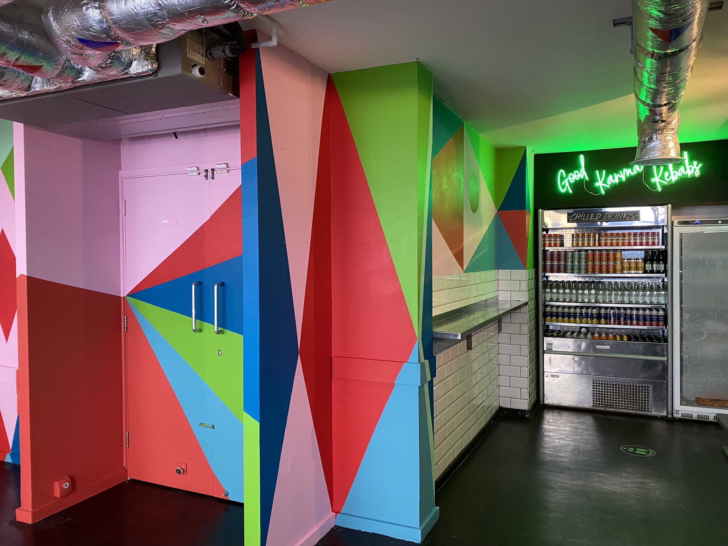
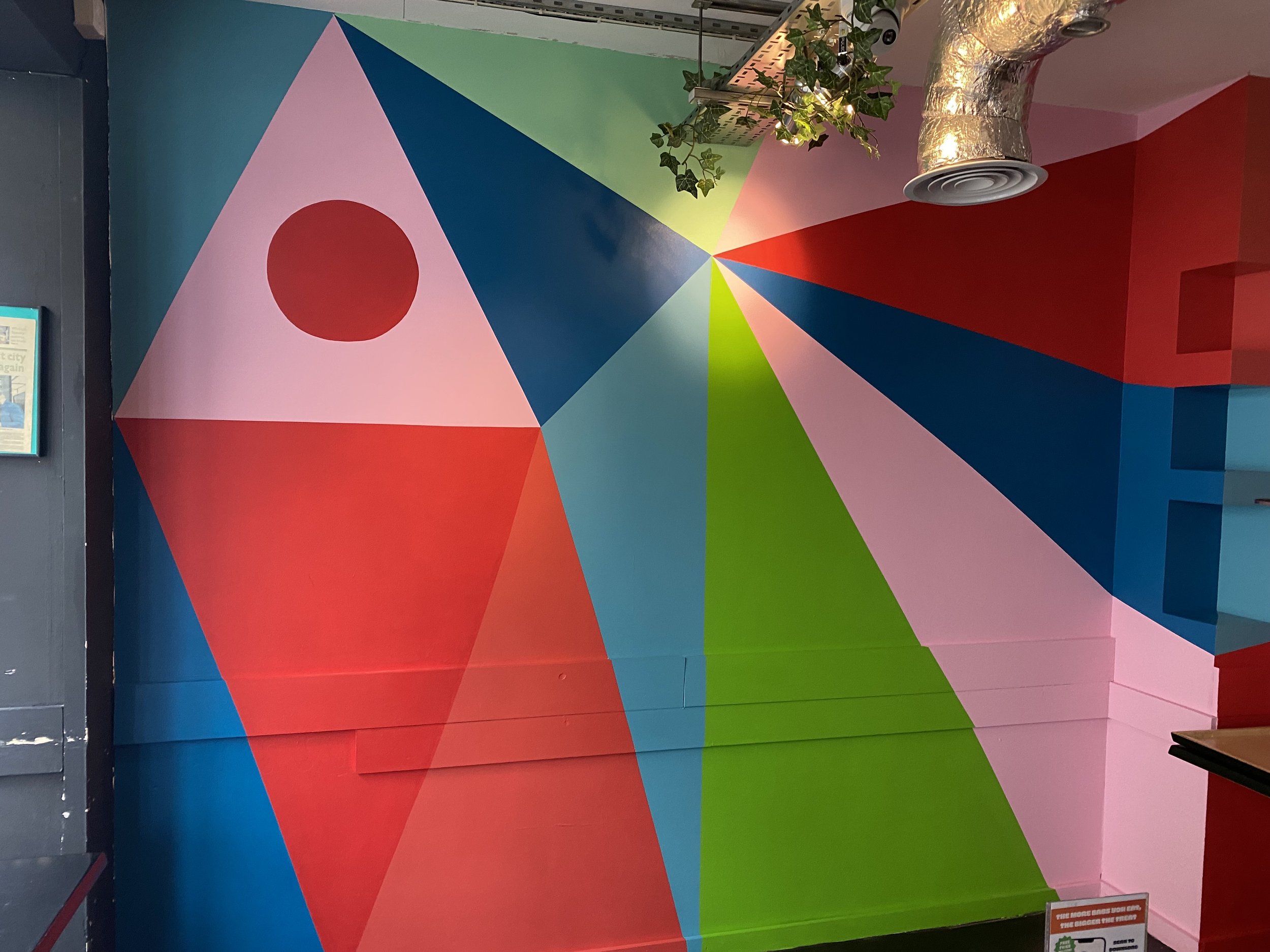
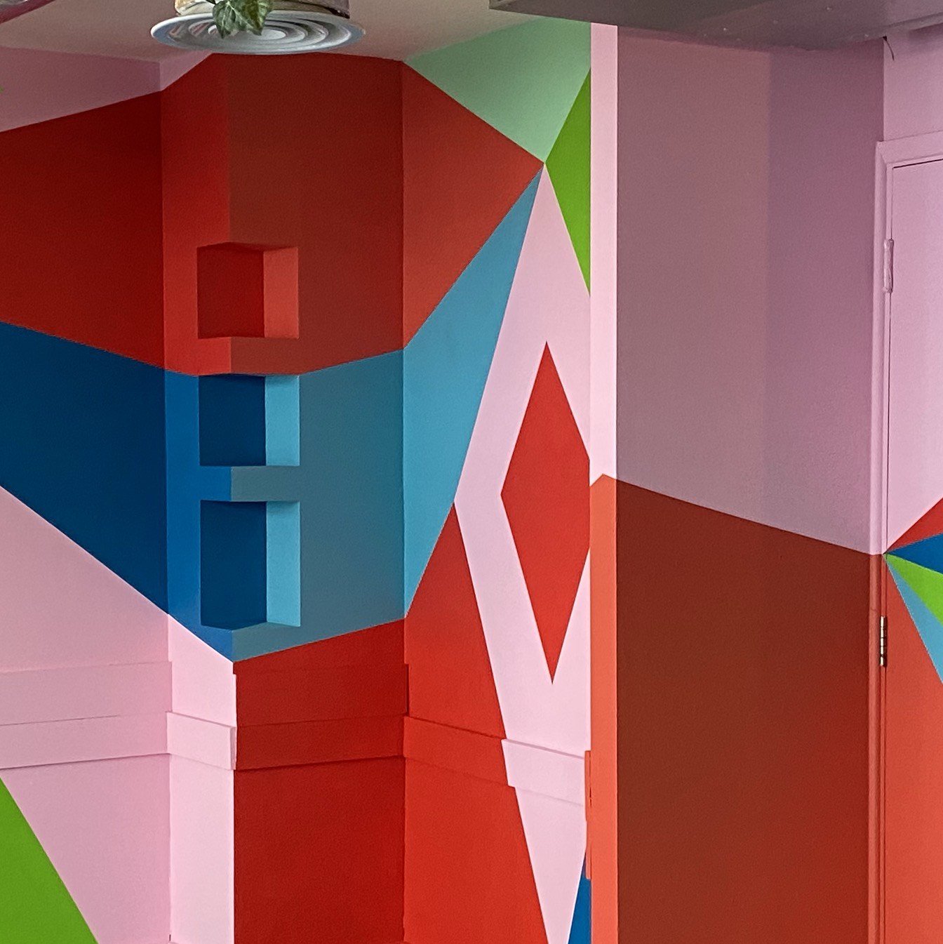
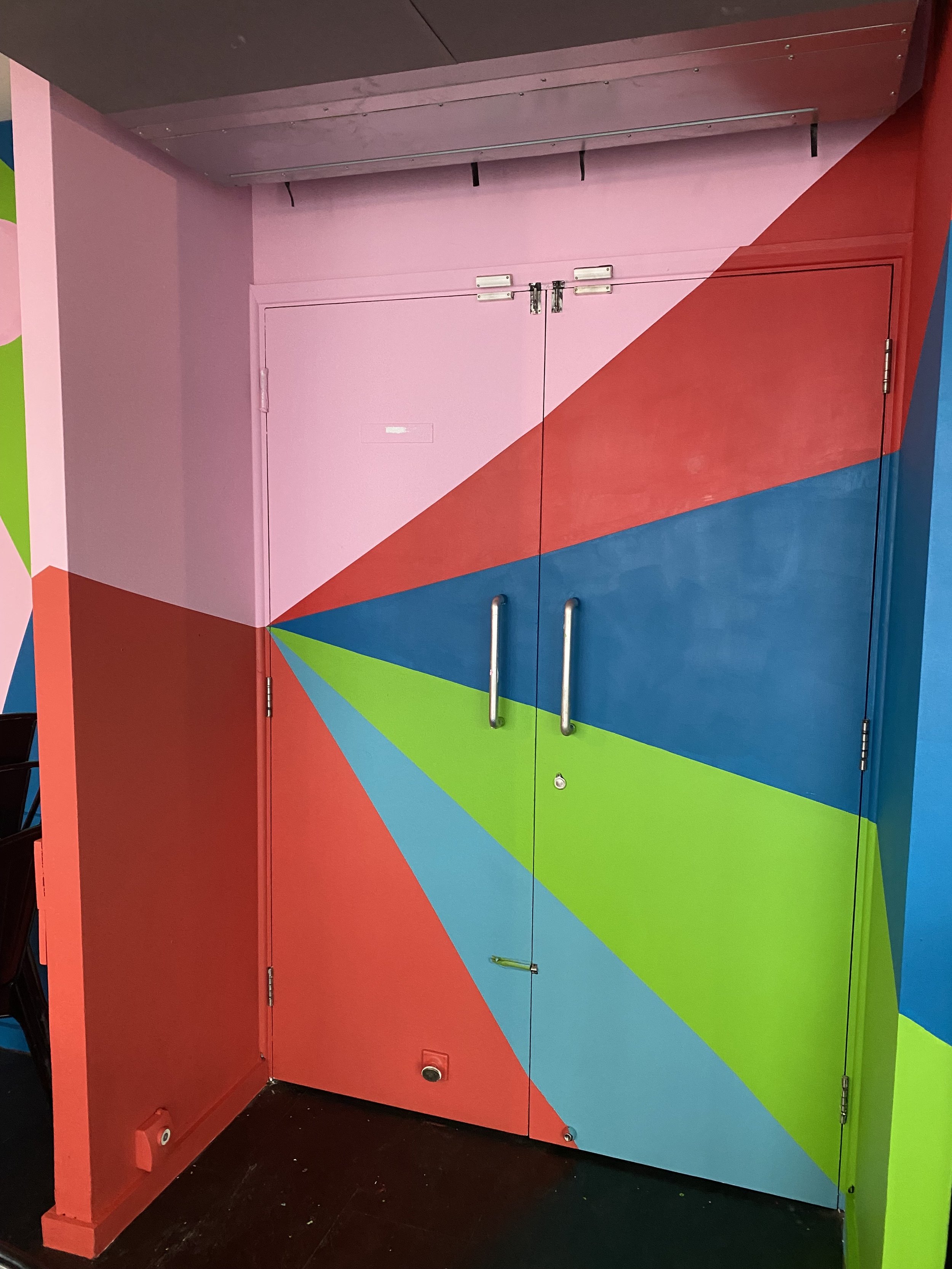
I had the pleasure of working on the refurbishment of a local Brighton eatery, where I was tasked with creating a mural that embraced a bold and energetic color palette. The client requested the use of two vivid brand colors—bright red and lime green—which, while not colors I would typically gravitate towards, presented an exciting challenge. It was an opportunity to step outside my usual aesthetic and explore the dynamic possibilities of these striking hues. The result was a vibrant, high-energy design that added a fresh and distinctive character to the space.
The mural wrapped around the entire interior, enveloping the walls and extending across doors and skirting boards, which has now become a signature element of my style. This immersive approach allowed the design to flow seamlessly throughout the space, creating a cohesive visual experience that brought the eatery to life. The bold color combination and integrated design not only elevated the space but also captured the spirit of the brand in a way that was both playful and impactful, leaving a lasting impression on all who visited.
